This page exists as a home for my smaller projects, along with posters of all kinds.
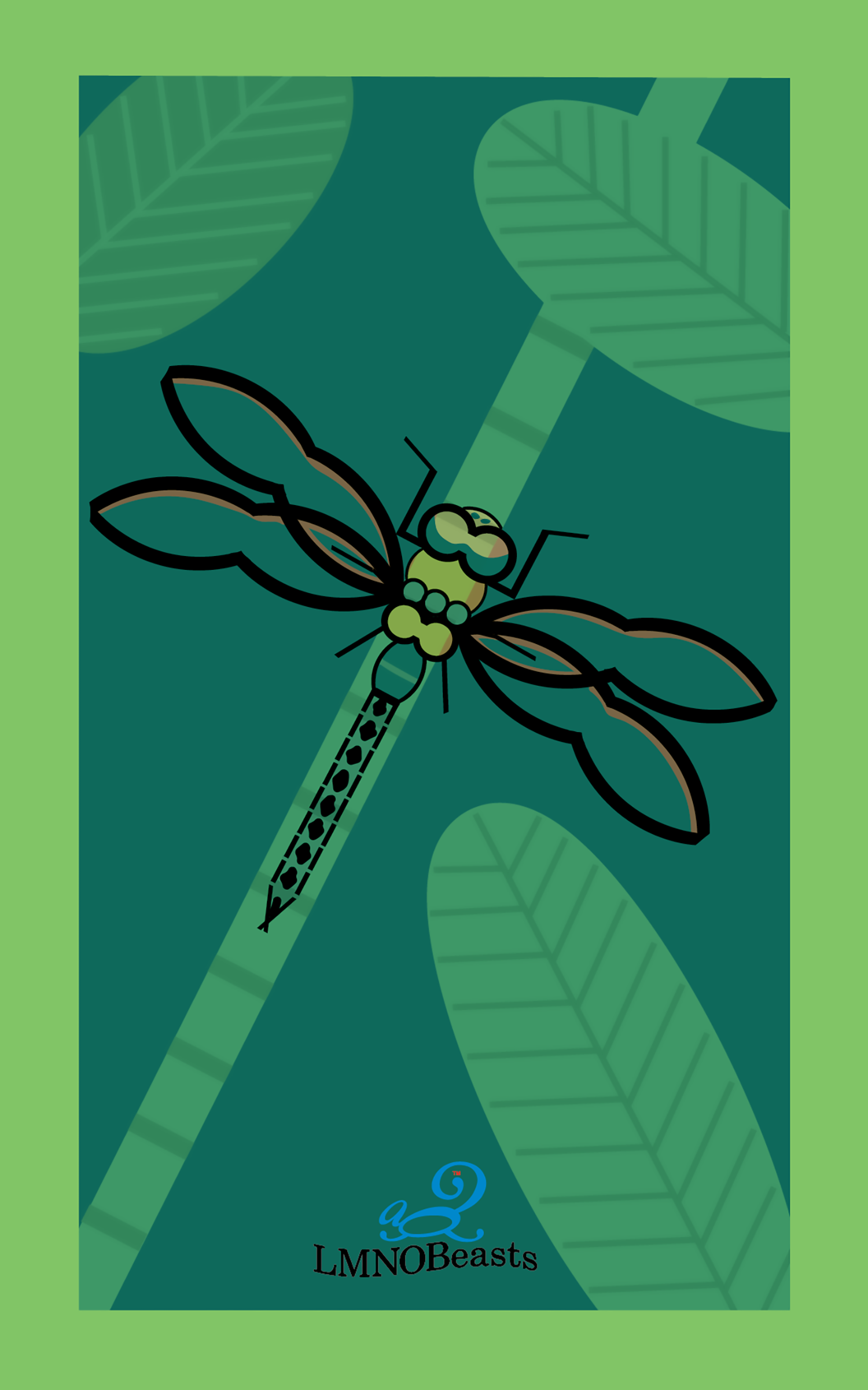
LMNOBeast
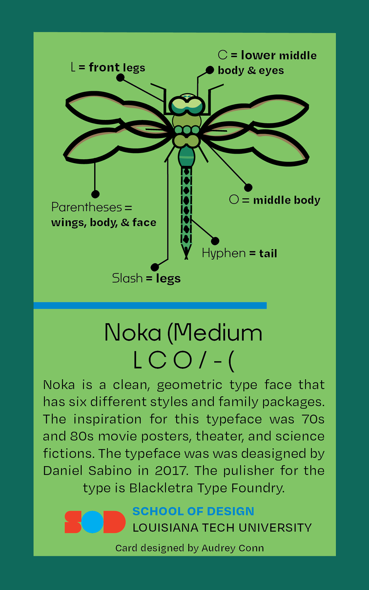
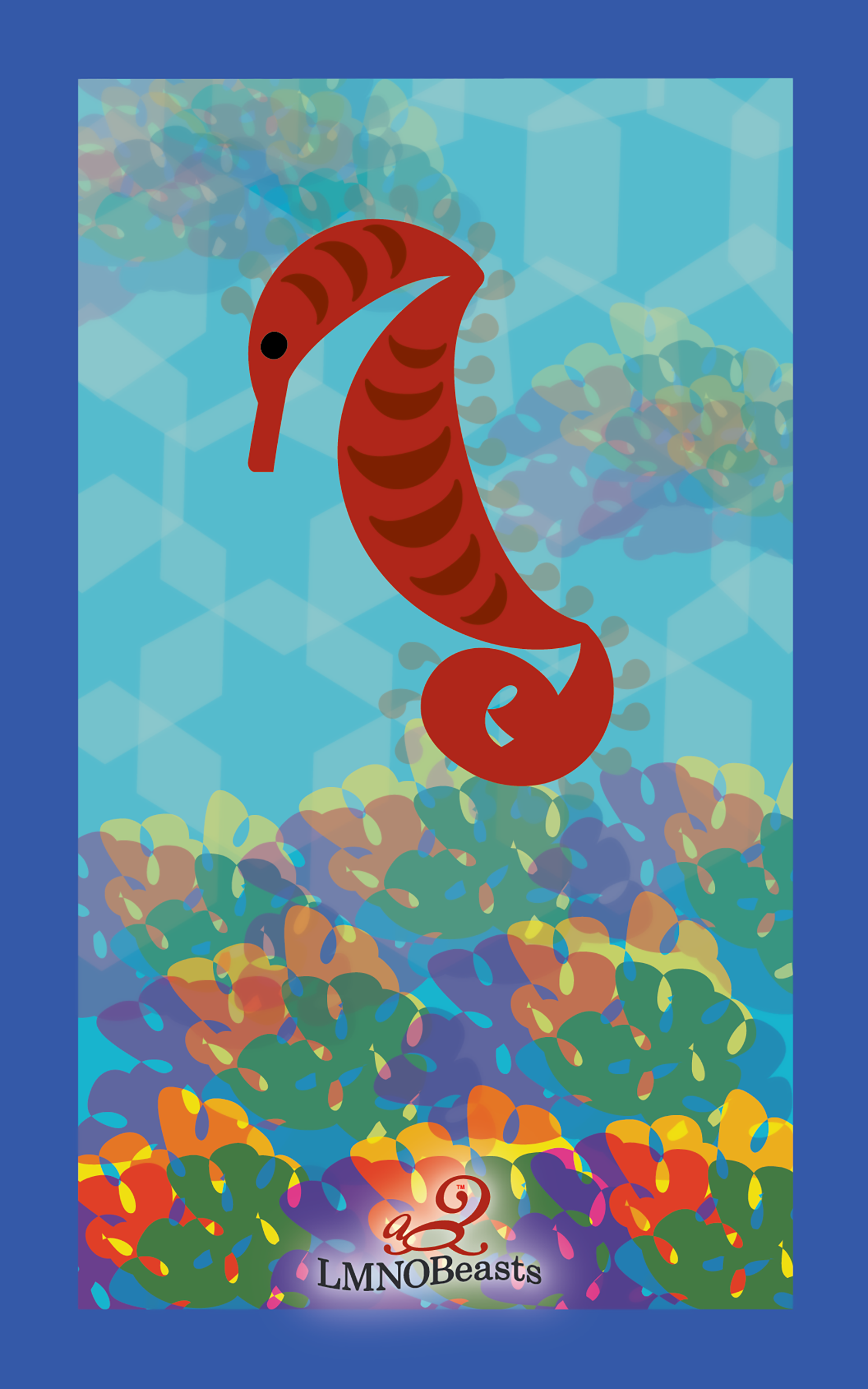
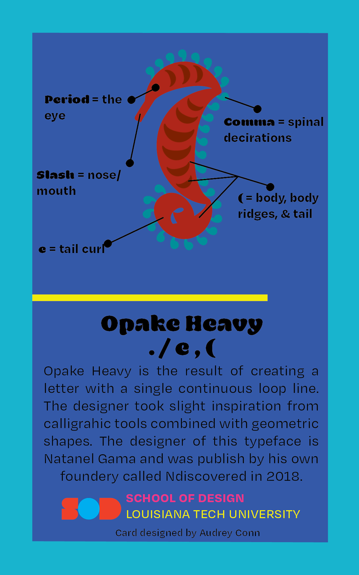
These cards were made as a typographic study. A typeface was chosen that gave the same vibe as the animal chosen, then we proceeded to do research on the typeface. This exercise was meant to break down the barriers of our perception of what type can and can not be used for; this would get us thinking of different ways to experiment with type for future projects.
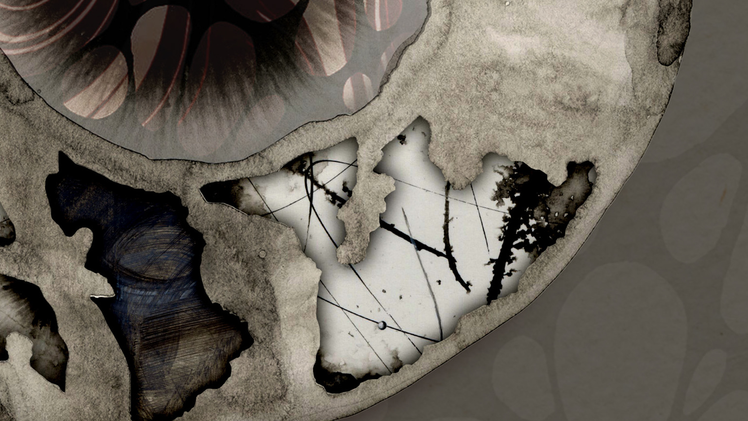
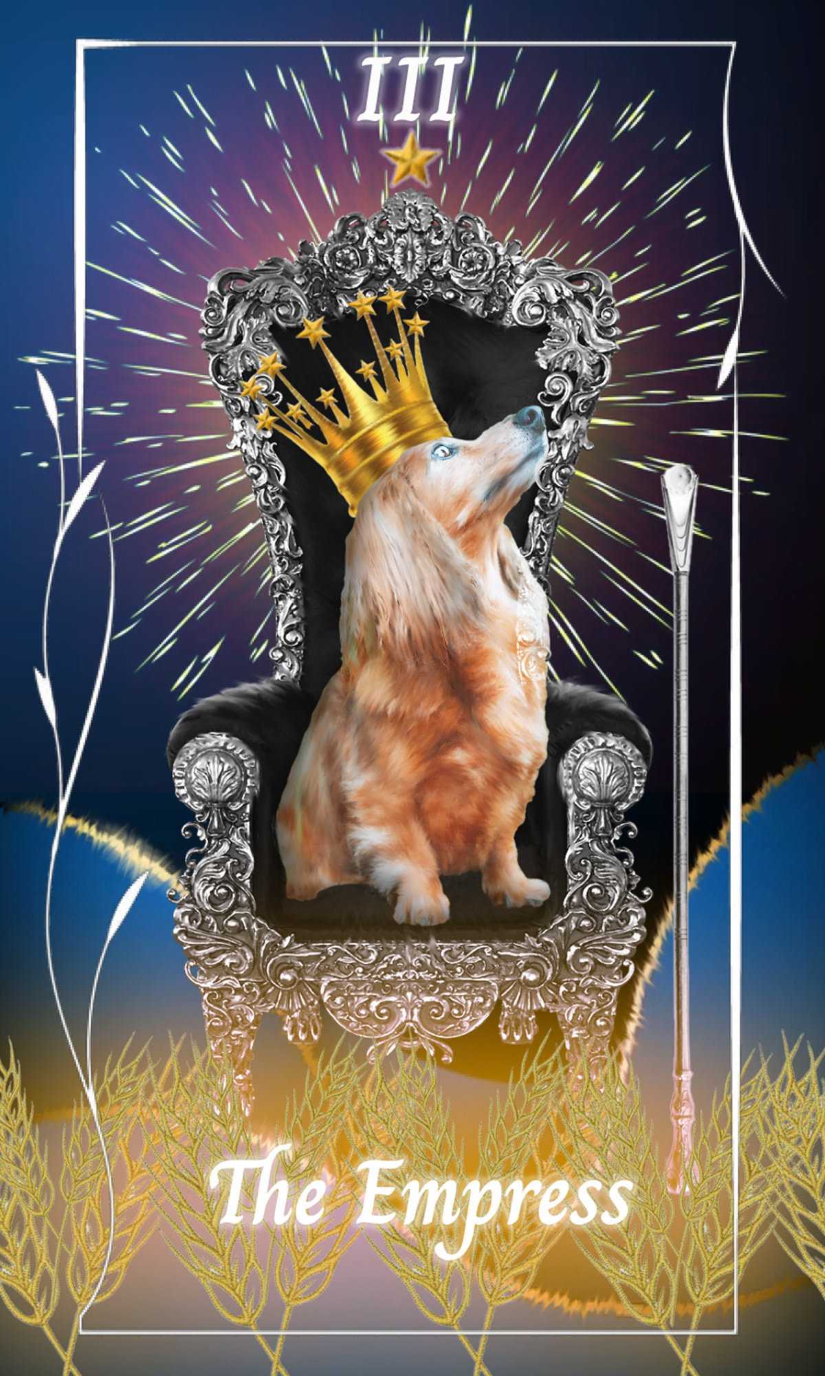
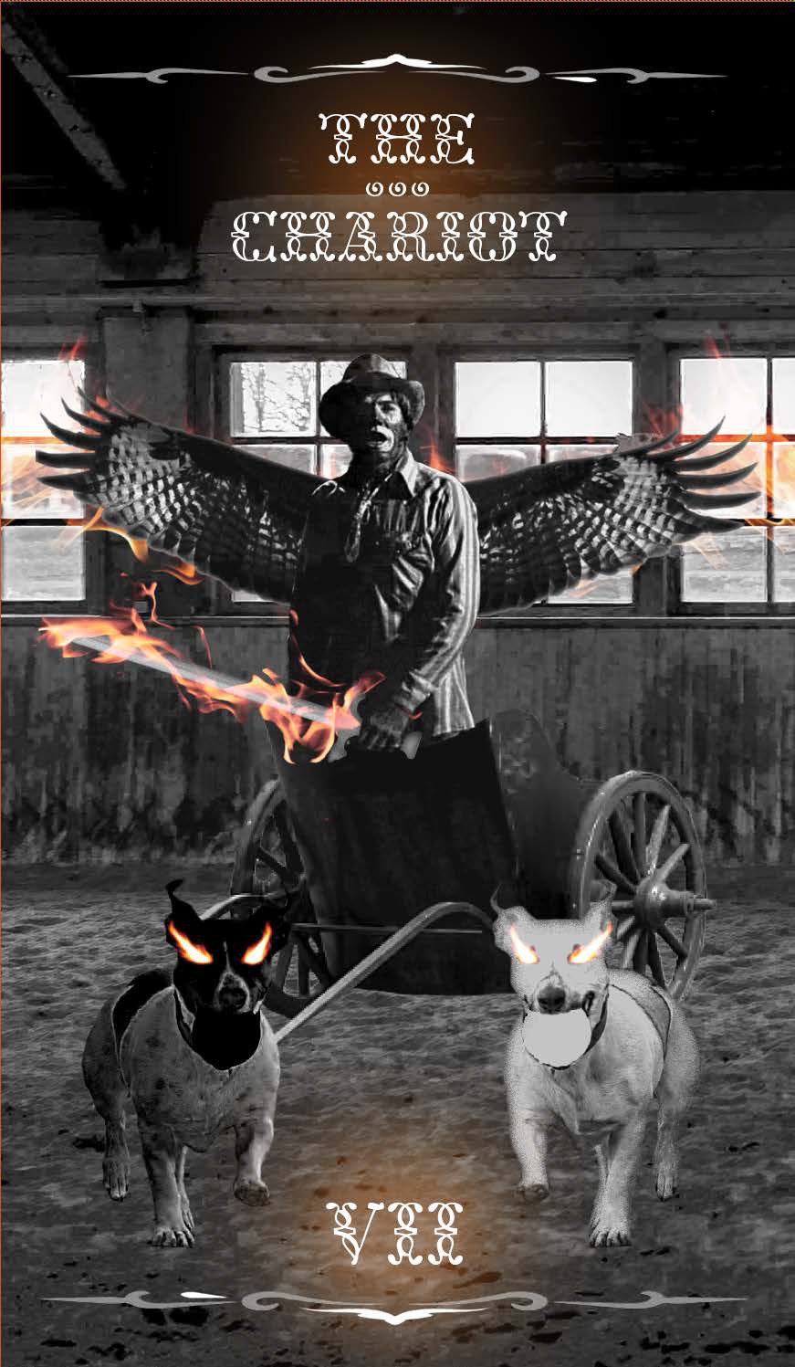
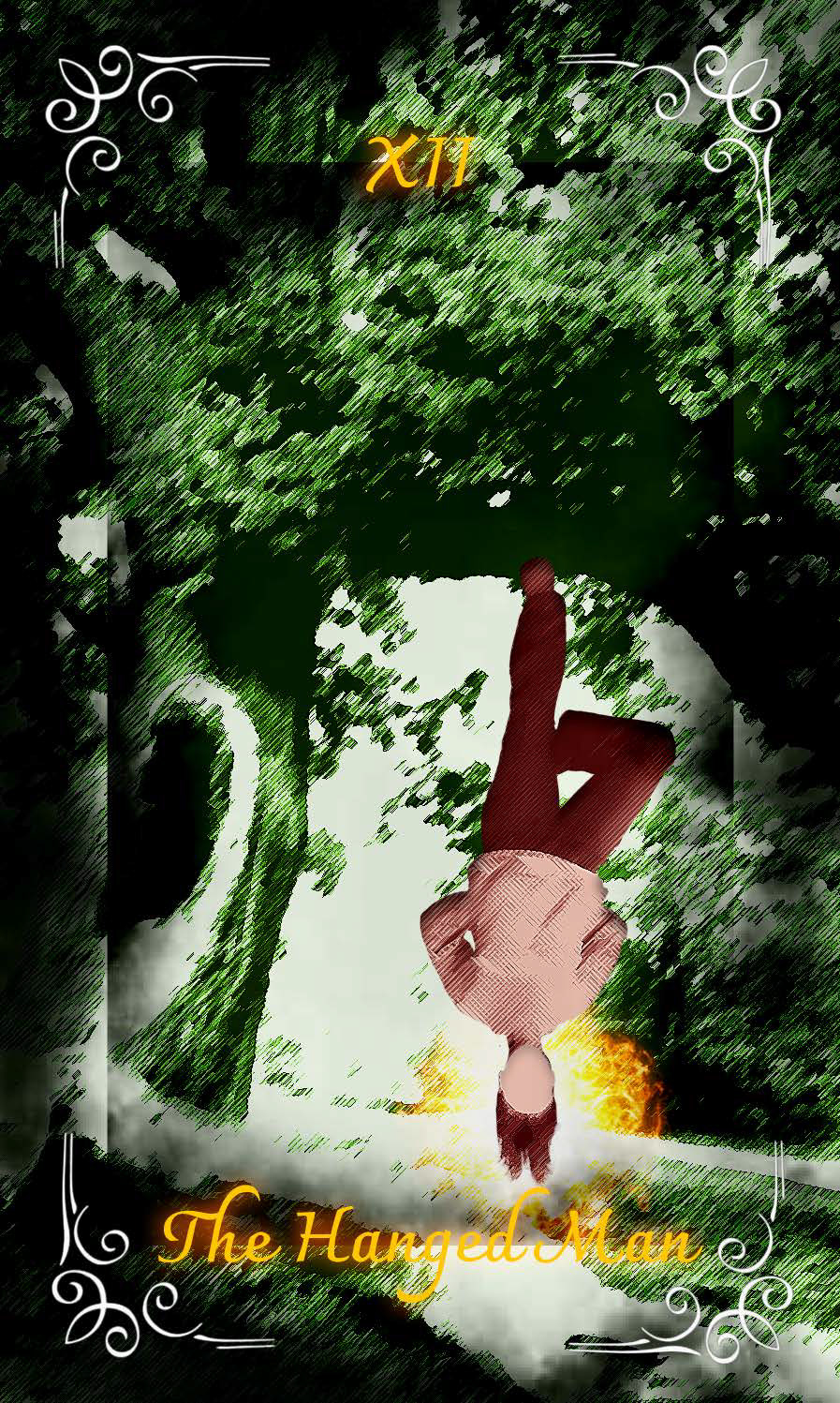
Tarot Cards
These cards were my first real exploration of Photoshop that went beyond simple edits, such as lightening and darkening photographs. That was the main goal of these cards as well: to introduce the many ways Photoshop can be used and what can truly be done with photo manipulation.
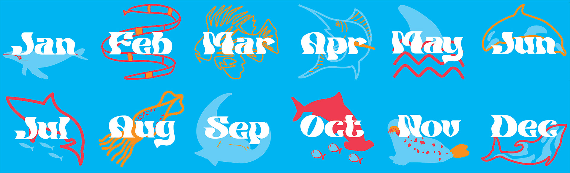
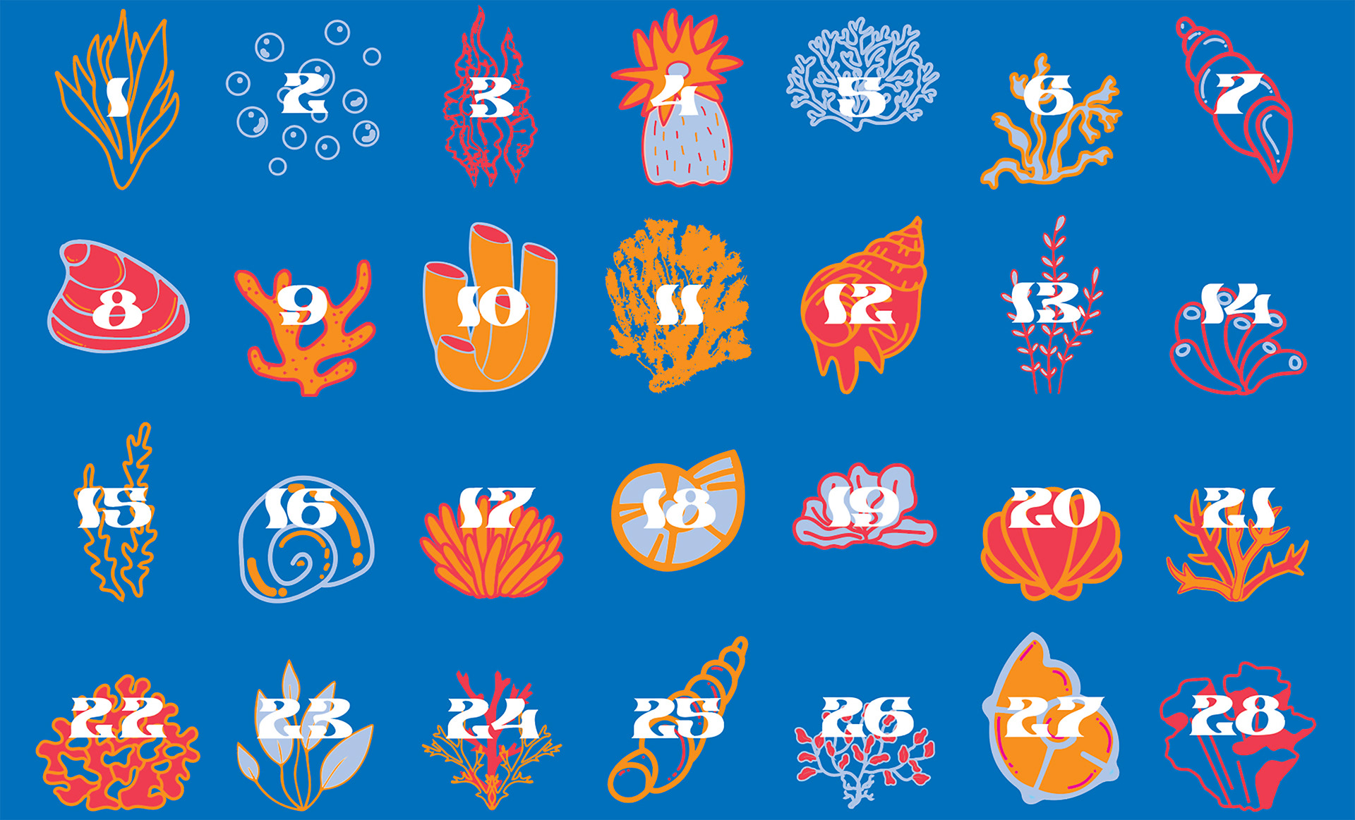
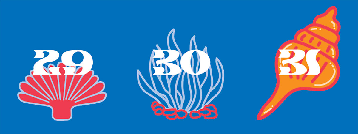
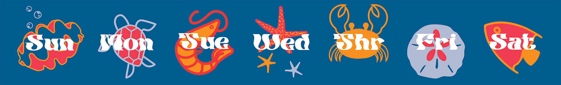
Calendar
This calendar was a lesson in production and craft. The final of this project was a small desk calendar that could be flipped to show the desired dates. For the design, I went with an aquatic theme. The largest part of a date (the months) is large, see creatures such as sharks and whales. The part of a date with the most content (the days of the month) is sea plant life and shells. Finally, the days of the week are other well-known sea creatures, like a sea turtle and a starfish.
Movie Poster
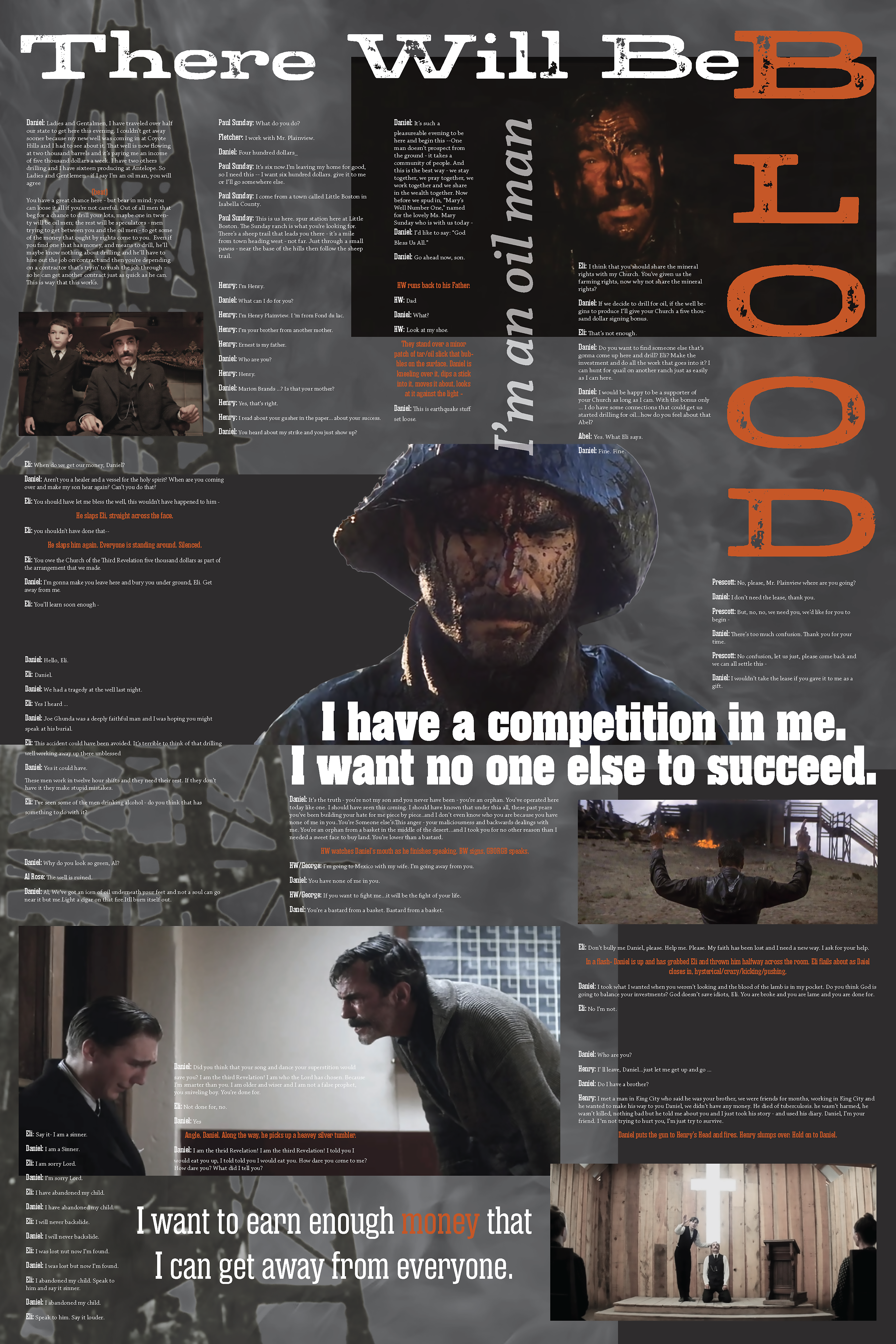
This project was an exploration in combining large amounts of type with imagery to create an interesting layout. It was also an introducting into information and long-form typography design. This poster is a dissection of the movie "There Will Be Blood." The goal was to create a movie poster that caught the vibe of the movie while laying out imagery and script in an organized way.
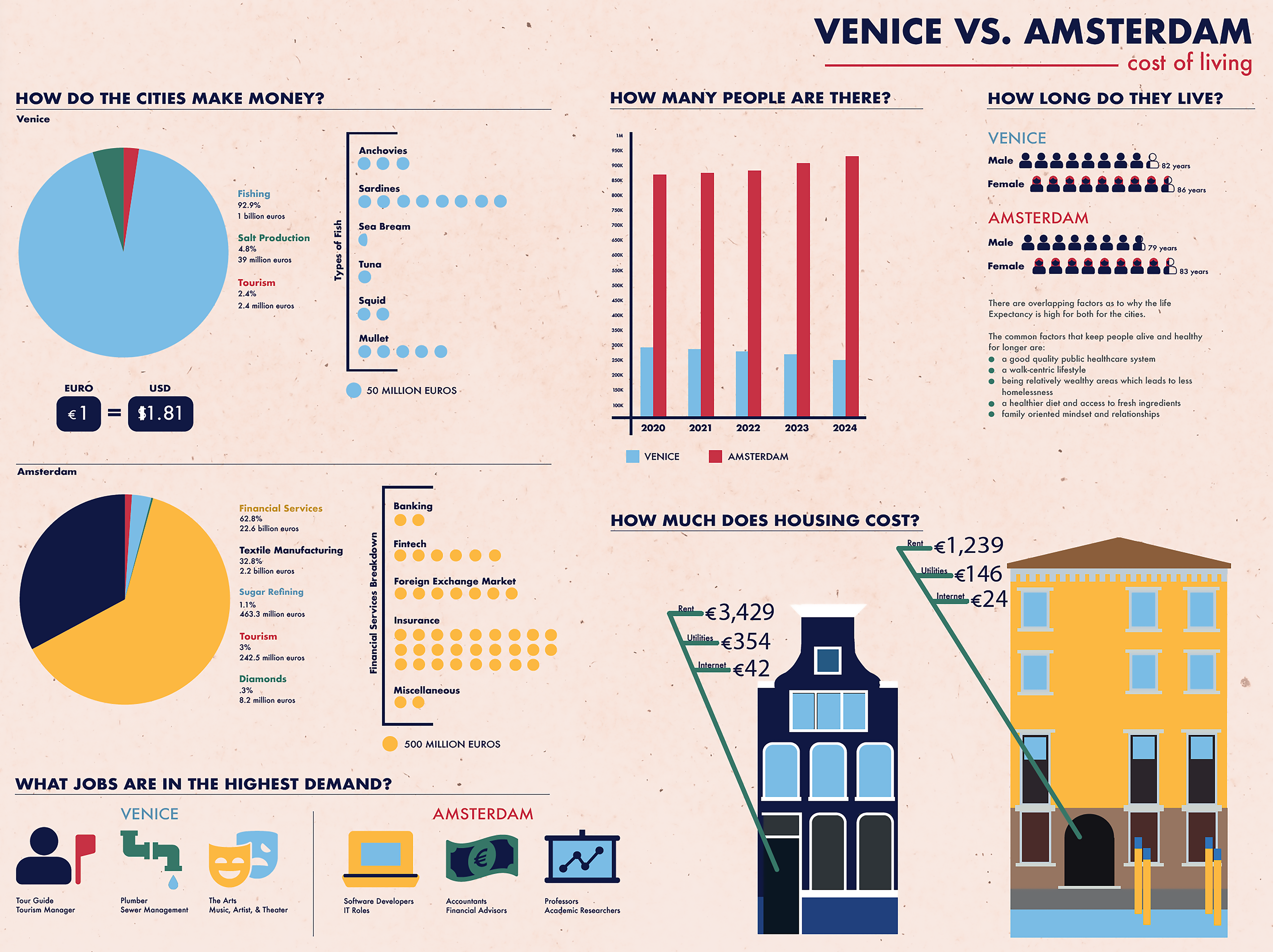
City Poster
The poster shown here is one of a three-poster series that was created for a group project; this is the poster I was responsible for producing. The purpose of this project was to research two cities, compare and contrast them, and then design a poster that adequately shows the information found. As a team, we created a cohesive language of design that was shown across the three posters. We came up with the type combos, color palette, flat 2D illustrative style, and overall visual language.
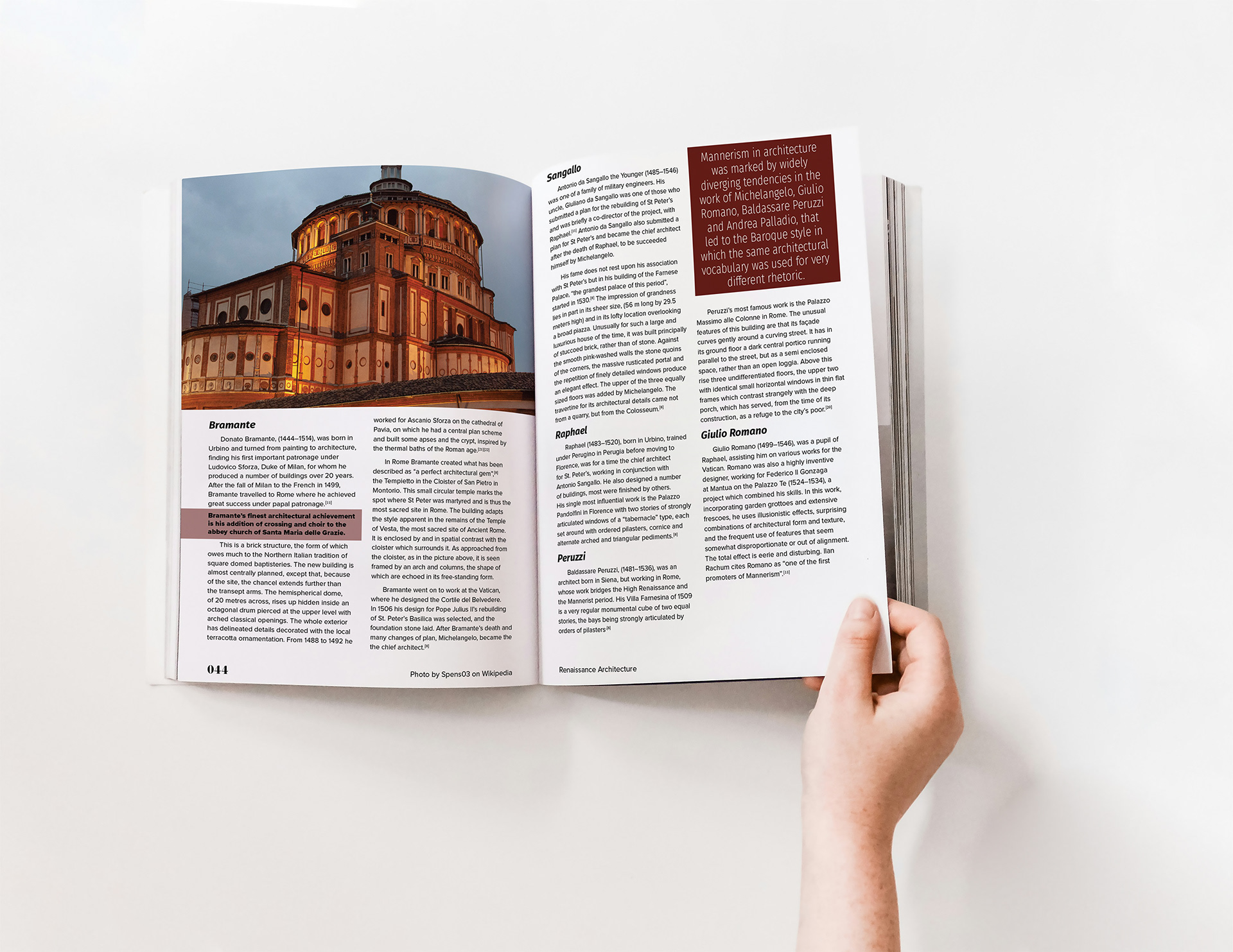
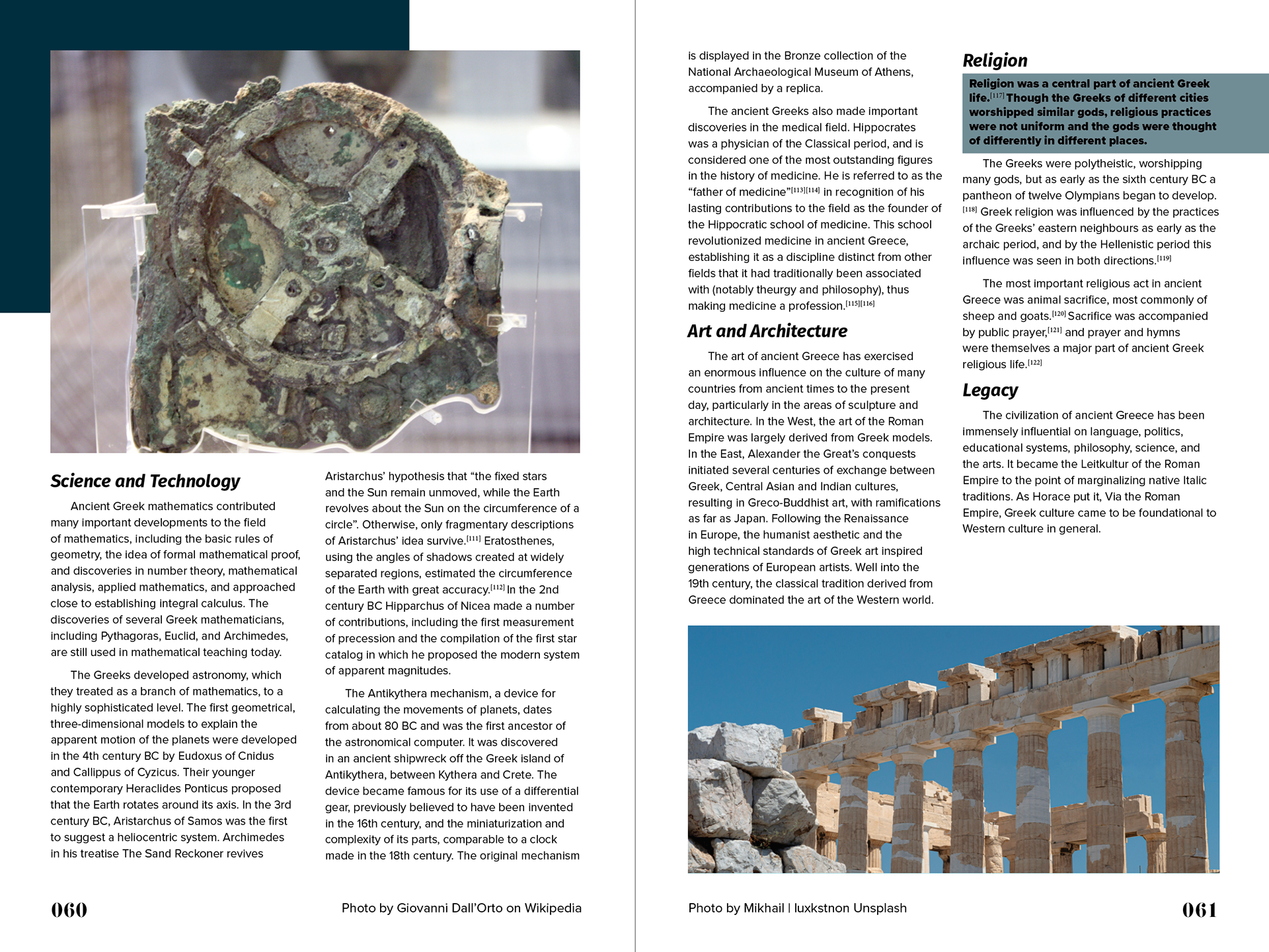
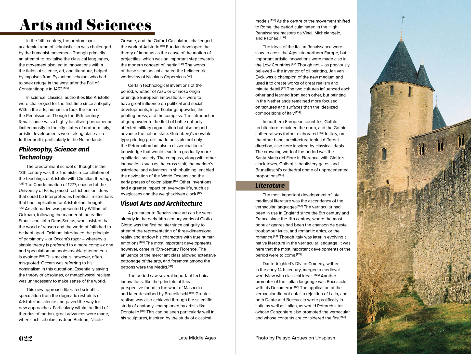
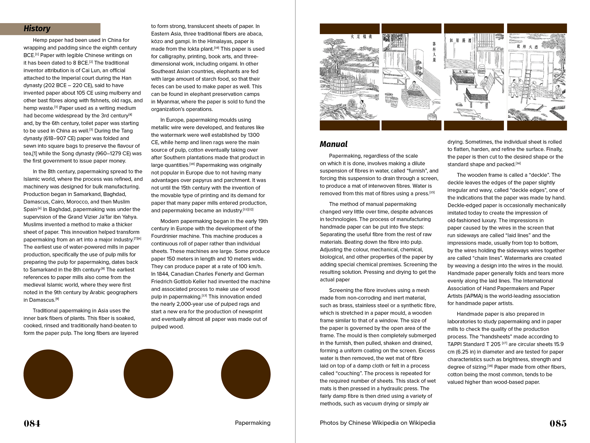
Typopedia Magazine
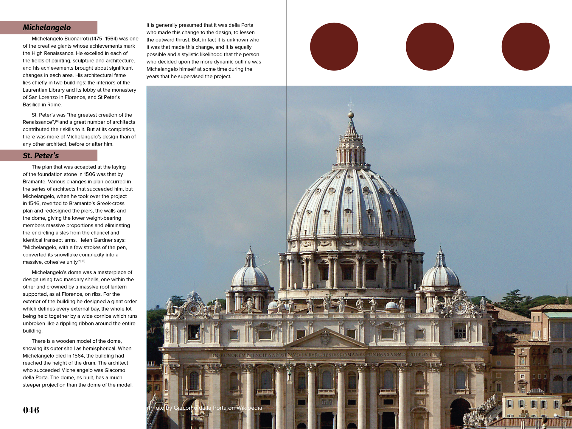
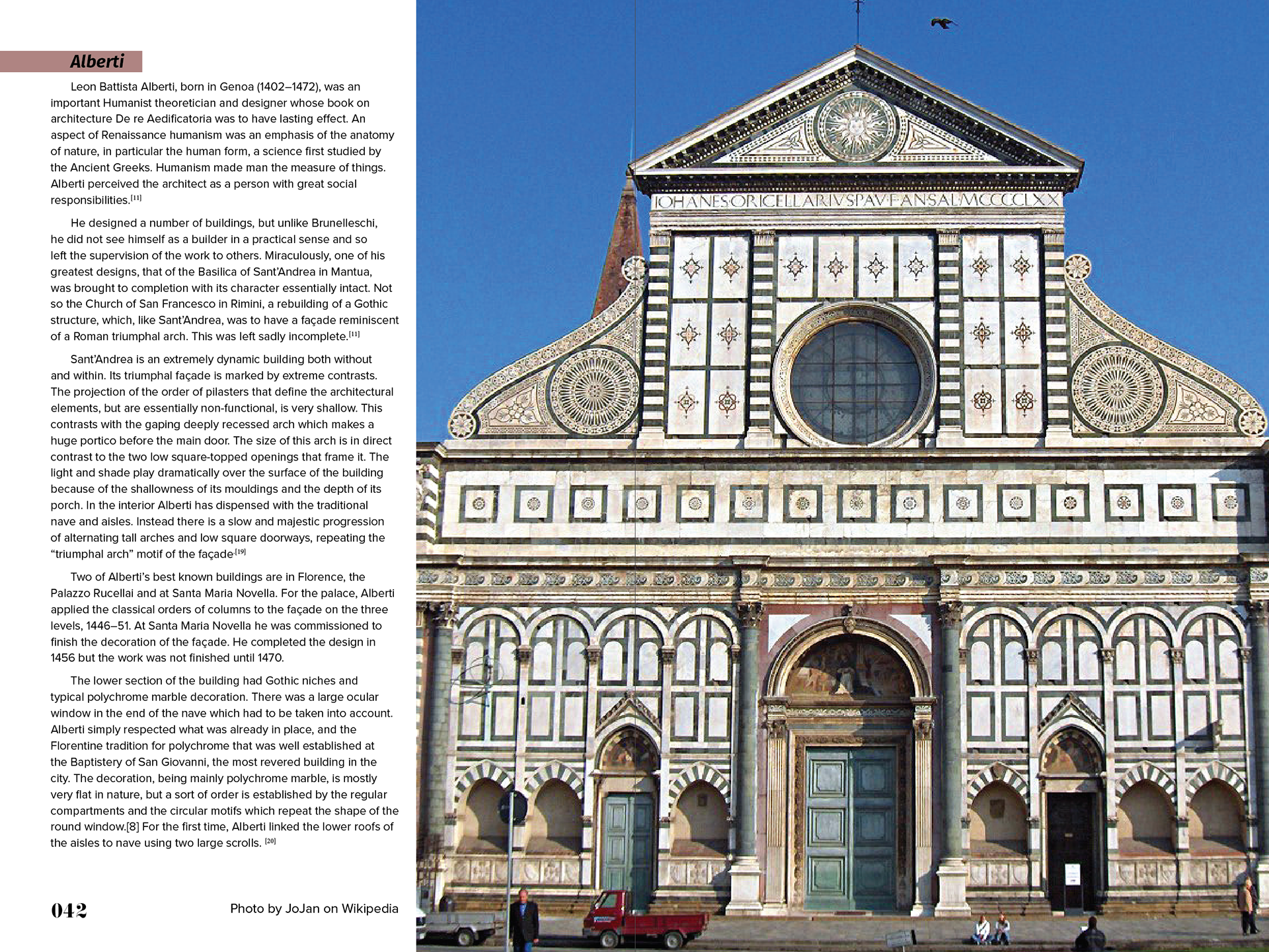
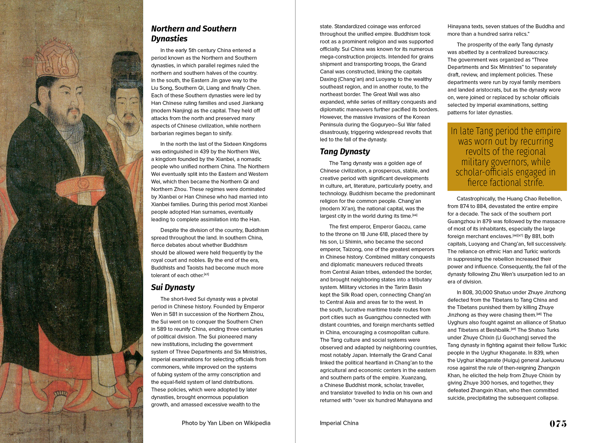
The project below is a 102-page magazine that I put together. Of course, not all of the pages are shown, but what is shown is to get an idea of the visual identity I made for the magazine. When I made this, I was interested in combining lower opacity color blocks with full opacity blocks. I also wanted to have different ways to show important lines of text or quotes. This magazine covered 10 different topics. For the identity I created, each section had a different color with a certain number of color blocks that each page had to have. This would change depending on how much of the spread was covered by an image and how much was wording to create balance between image, color, and type.